Workout TV UX: What to Show (and What to Avoid)
Learn the best Workout TV UX for gyms: what to show on a Workout Display (high-contrast timers, large text, clear video demos) and what to avoid (clutter, small fonts, fluff). See how Fit Viz delivers member-first Workout TV layouts that guide class flow with integrated timers and visual workout guidance.

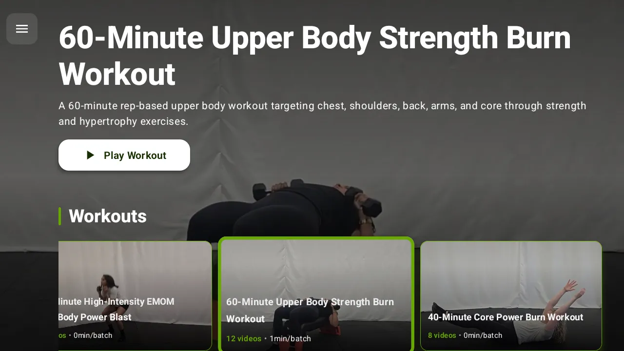
A Workout TV should be a tool, not a distraction. The best screens don’t entertain members during training - they guide them. That’s why the user experience (UX) of your Workout Display matters as much as the workout itself. When the screen is hard to read or cluttered, athletes stop using it. When it’s clear and timed correctly, the room runs smoother, coaches coach more, and members feel more confident.
In this post we will expound on:
- Clarity-first visual design (timers, typography, contrast)
- Workout guidance through video demos and “what’s next” cues
- Fit Viz’s member-first layouts and how they perform on the gym floor
- How Workout TV UX connects to real class execution (timers + flow)
Why Workout TV UX matters more than you think
In a gym environment, people are:
- Breathing hard
- Moving quickly
- Looking up for seconds at a time
- Sometimes facing away from the screen
- Often in loud rooms with distractions
Your Workout Display has to work in those conditions. This means UX isn’t about “looking nice.” It’s about being readable and useful under fatigue. A great Workout TV becomes the shared reference point for the room. A bad one becomes background noise.
What to show on a Workout TV
1. High-contrast workout timers (the non-negotiable)
If your Workout TV shows only one thing, it should be the timer.
Great timer UX means:
- High contrast (light text on dark background or vice versa)
- Very large digits readable from anywhere
- Obvious transitions between work/rest
- Clear signals for EMOM, AMRAP, Tabata, intervals, and time caps
- “Round count” or “minute count” when relevant
Members should never have to squint or walk closer to see the clock. If they can’t see the timer, the screen fails.
Fit Viz advantage: Fit Viz timers are built to run classes, not just tell time. The timer is integrated into the workout flow and can change state clearly during intervals so athletes always know whether they are working, resting, or transitioning.
2. Large, structured text (block-based workout clarity)
Workouts are easiest to follow when displayed as a structured flow, not a paragraph.
The best Workout Display layouts show:
- Workout blocks (warm-up, strength, conditioning, finisher)
- The current block highlighted
- The next block visible in a “coming up” area
- Simplified rep schemes and standards that can be scanned quickly
- Scaling tiers when relevant (Rx, intermediate, beginner)
Text should be optimized for “glance reading,” not long reading.
Fit Viz advantage: Block-based clarity
Fit Viz is designed around block-based display, so members can instantly orient themselves - what we’re doing now, what’s next, and how long it lasts.
3. Clear video demos (only when they add value)
Video demos are extremely useful, but only when they’re implemented with intention.
Good demo UX means:
- Short looping clips (not long videos that require attention)
- Consistent framing and easy-to-understand angles
- Placed next to the movement name and reps
- Optional display (some classes need less visual stimulation)
Demos reduce coaching repetition and help new members follow along without feeling lost.
Fit Viz advantage: Visual workout guidance
Fit Viz supports visual workout guidance and exercise demonstrations on screen, reducing the need for coaches to re-explain movements and making the workout easier to follow under fatigue.
4. “What’s next” cues and transition prompts
The biggest class flow killer is transition confusion. Members hesitate, look around, and ask questions. That lost time adds up.
Effective Workout TV UX includes:
- “Next: Station 3” or “Next block starts in 0:30”
- Rotation prompts for station circuits (“Rest & rotate”)
- Interval state changes that are visually obvious
- Time remaining next to the movement being performed
Fit Viz advantage: Real-time class guidance
Fit Viz is built to guide the class in real time, not just display a workout. Transition prompts keep large groups synchronized without shouting.
What to avoid on a Workout Display
1. Cluttered backgrounds and low contrast
Busy textures, gradients, and visuals behind text reduce readability, especially under glare or distance. The more the screen looks like marketing, the less it functions as a coaching tool.
2. Small fonts and dense paragraphs
If you need to stand close to read the workout, members won’t use it. The gym is not a desktop monitor environment. Large text and short lines win.
3. Too much “fluff”
The Workout TV should not be packed with:
- Excessive branding overlays
- Quotes and announcements during work intervals
- Too many stats that don’t affect action
- Multiple competing information zones
The question your screen should answer is: What should I do right now?
Everything that doesn’t help that should be removed.
4. Constant switching between unrelated content
Rotating between announcements, timers, and workouts during a class creates confusion. Digital signage belongs in the lobby. Workout guidance belongs on the training floor.
Fit Viz advantage: Zone-based screen modes
Fit Viz supports different screen modes by zone, so you can keep Workout Displays focused during class while using separate screens or scheduled modes for lobby communication.
Member-first UX: what Fit Viz does differently
Fit Viz is designed around how members actually use screens in real gyms:
- Short glance time
- High fatigue
- Varied viewing angles
- Mixed ability levels
- Loud environments where verbal cues get missed
Fit Viz Workout TV layouts are built for the floor, not for a demo
A lot of software looks good in a sales video and fails during a real class. Fit Viz emphasizes:
- High-contrast timers that dominate attention when needed
- Clean workout structure with current block emphasis
- Readable fonts and minimal clutter
- Visual demonstrations placed where they help most
- Prompts that keep members synchronized
This “member-first” approach reduces confusion, improves confidence, and makes classes feel more professional.
The operational payoff of good Workout TV UX
Better Workout Display UX creates real business results:
- Fewer interruptions and questions mid-class
- Smoother transitions and on-time class endings
- Less coach burnout (less shouting, less timekeeping)
- Better new-member experience and faster onboarding
- Stronger retention because members feel successful and oriented
When members understand the workout, they engage more. When they engage more, they stay.
Conclusion
A Workout TV should guide training, not compete for attention. The best Workout Display UX focuses on high-contrast timers, large readable text, clear workout structure, and short video demos that help members execute correctly. Avoid clutter, small fonts, and unnecessary fluff that confuses athletes under fatigue.
Fit Viz is designed with a member-first UX informed by real gym-floor testing. Its Workout TV layouts provide exactly what members need, exactly when they need it - timers, workout guidance, and demonstrations that keep classes moving smoothly and keep coaches focused on coaching.